Brand · Website · Co-founded
Hardflip Coffee Co.
"Quality coffee. Premium performance. For those who grind on and off the board."
The idea
Coffee for people who grind on and off the board.
Hardflip started as a question. What does a coffee brand look like if it belongs to skate culture as much as to coffee? We started it from nothing and built out the answer, from blends and look to voice and everything the brand touches.
What we built
The whole creative side.
01
Identity
Logo, type, color, and the tone that ties coffee to skate culture.
02
The mascot and graphics
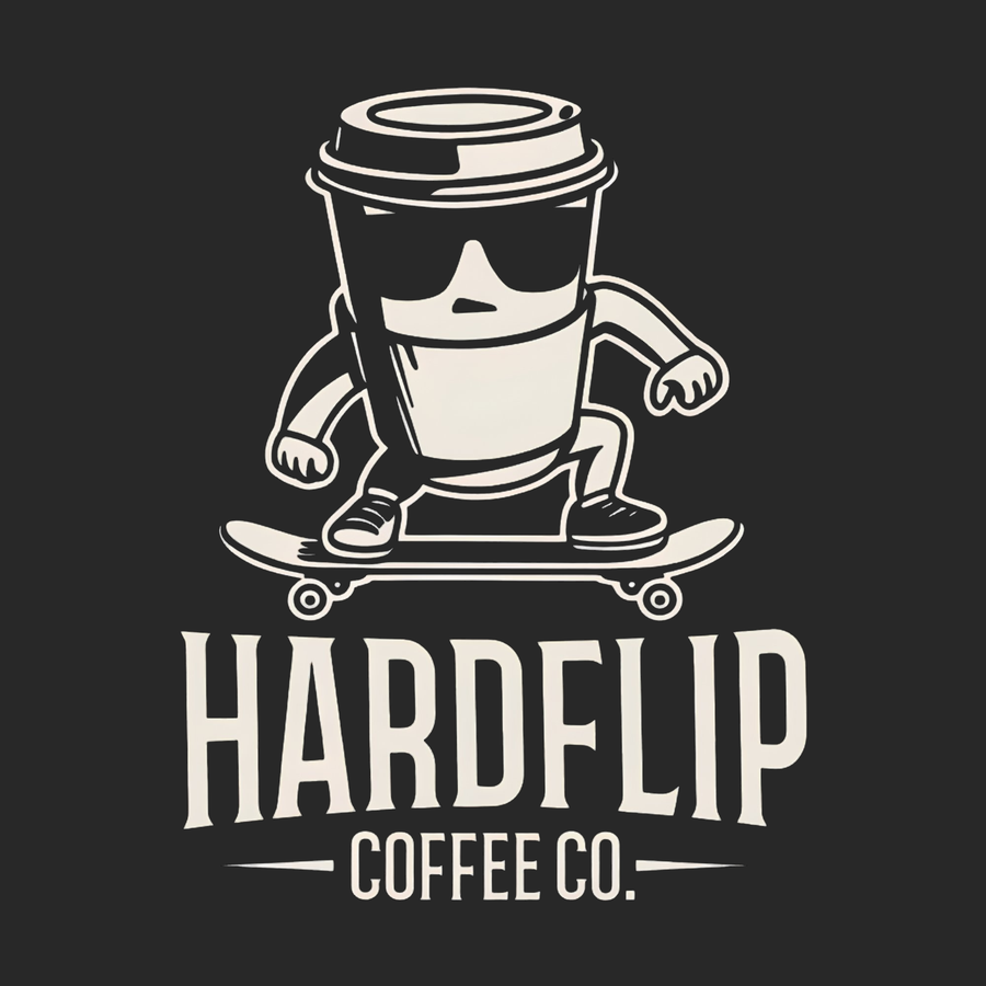
The skating coffee cup and every graphic carrying the name.
03
Product and naming
Shaped the lineup and named the Boardslide and Darkslide blends.
04
Merch
Apparel and drinkware, the part of a brand people choose to wear.
05
Storefront
Layout, product pages, and the buying experience.
06
Ongoing
We still run the brand's digital and social presence.
The takeaway
A brand is what makes a bag of coffee feel like something you'd rep. You can't add that afterward.
Where it landed
Two blends, a merch line, and a brand that doesn't look like the rest of the shelf.
Hardflip launched as a finished thing. Two blends, apparel and drinkware carrying the look, and an identity that reads as its own. It's the clearest example of what we mean by building the whole picture: a brand that launches looking like it's been around, because every piece was designed to sit next to every other piece.